Start With Your Logo
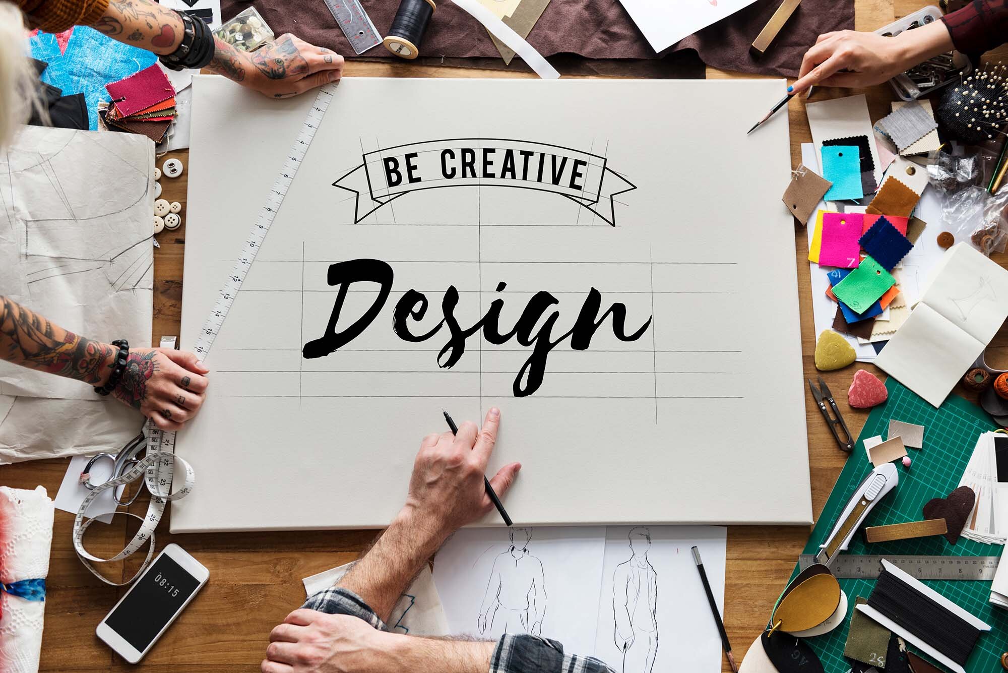
You might not yet have a final logo design if you’re a start-up. On the other hand, if you’re an established business, you likely have a logo, but is it updated, and how accurately does it reflect your brand? No matter what kind of business you’re in or how long you’ve been around, a logo is a key to distinguishing yourself from your competition. It is the starting point for effective, eye-catching creative design that expresses a sense of credibility to your prospective clients. Try it for yourself. Search for a product or service. Check out the websites on your first results page, then a few on the 10th or 15th. Look at the logos. Do some look more professional than others? Yep. Does that make you more likely to use that business than the one with the amateurish mark? Absolutely. Once you have a standout logo, use it consistently on every page of your website, allowing it to serve as an anchor for your visitors’ eyes.Function Before Fun
While you want your website to stand out, it has to do its job above all else. That means it has to help visitors access information about your business — and hopefully purchase your products or services! A functional website begins with easy-to-use navigational features. Scroll bars should be predictable: vertically down the right side or horizontally at the bottom. Use consistent placement on all your web pages. Also, be sensible when creating your menus. You can have a little creativity here, as long as your web visitors can still find what they need and fast. Organize and label sensibly.Now the Fun of Creative Design
With a good logo and functional layout in place, it’s time to start building a look that expresses your business.
You’ll want to pick a color scheme that complements, contrasts, and reflects the tone of what you do. For instance, if you’re a nonprofit that benefits children, you might go with primary colors rather than a slate of cool grays.
Next, you’ll want to choose the right images. In an increasingly visual society — how many emojis have you used today? — images are more important than ever.
The pictures you choose for your website should, of course, be high-quality and relevant to what you do. Also, consider the emotions your images provoke. Do they match the tone of your website and your business?
‘A picture is worth a thousand words.’
If you’re positioning yourself as the hip, new-kid-on-the-block firm with fresh ideas, it is probably best to use a picture that portrays that image.
Are you going for the gold with your website? Make your photos actionable — have more info appear when users hover over them or have them link elsewhere on your site.
The bottom line on creative design
Use this as your starting point for creating a website that not only works but stands out from the rest. Then, get ready for positive feedback from your customer base.
Need help? Quick Web Design offers a full range of logo and website design services. Contact us to get started today!!


