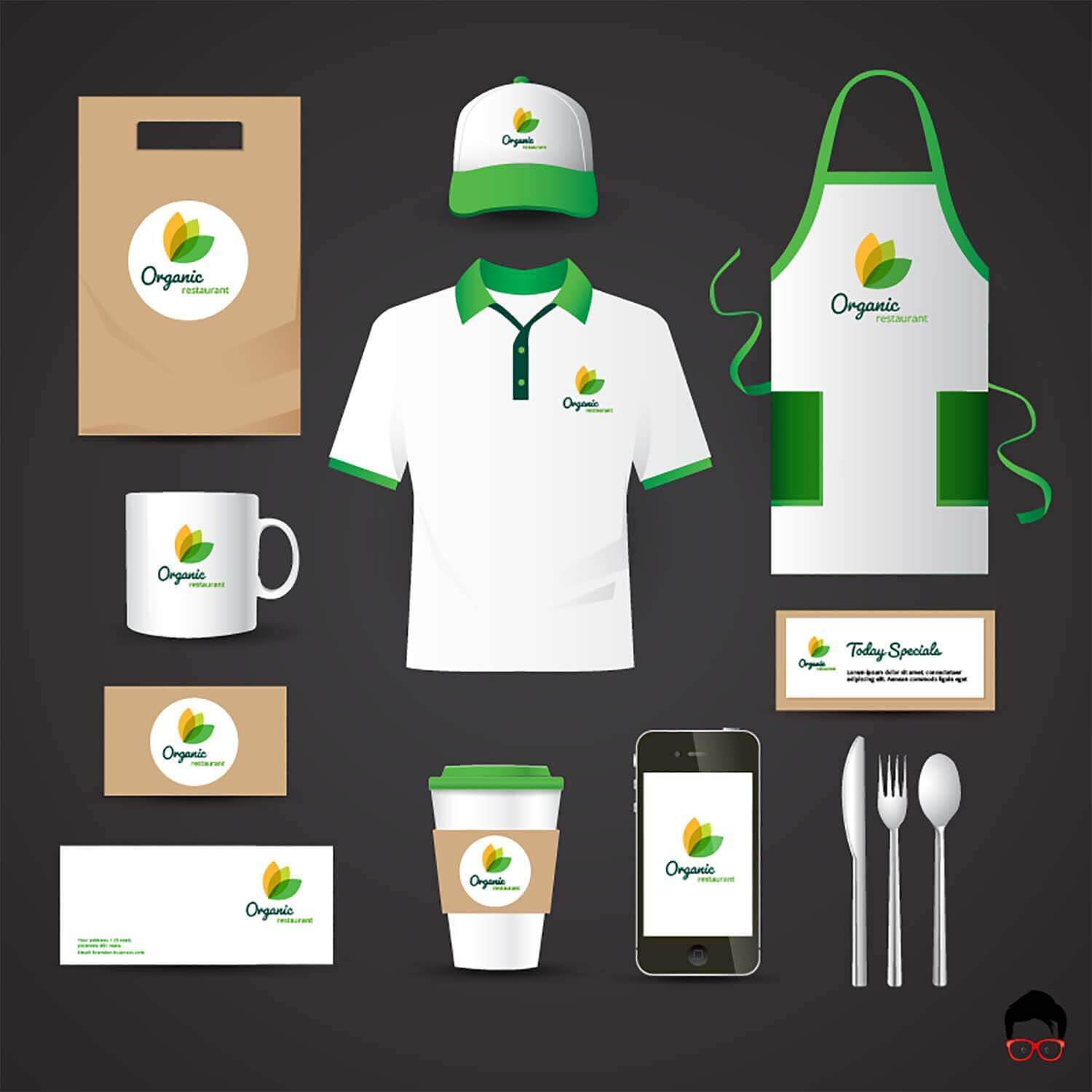
Why do brand colors matter? Did you know that 62‐90% of product assessment is from colors alone? So people will judge your brand on your logo color scheme.
Is that fair? Maybe not, but it’s the truth.
To put your brand head-and-shoulders above the competition, you’ll need to be especially mindful of the colors you choose for your logo. But how do you even know where to begin?
Fortunately, we can help with that. So keep reading below as we give you some general information that will help you determine if you need design services.
Colors by Industry
You’ll want to begin by examining what colors are often chosen by other companies in your industry. If most of the Fortune 500 companies in your industry use the same color in their branding, you’ll want to know why. But you’ll also want to stand out with your palette.
For instance, blue is used in over 75% of credit card brand logos and 20% of fast-food logos. Red, meanwhile, can be seen in over 60% of retail brands. So why do these brands choose the colors they do?
The Psychology of color is what you need to explore and understand to choose your brand colors.
The Psychology of Color
It’s not a gimmick or superstition. There’s the natural science behind how we, as humans, react to different colors. We associate other emotions with different colors, and it’s powerful stuff.
Here is a list of the most common emotional associations with colors.
- Red – danger, excitement, impulsivity, energy, love, and passion
- Pink – feminine, hopeful, inspirational, youthful, and bold.
- Orange – fresh, full of spirit, creative, and daring.
- Yellow – optimistic, encouraging, and friendly, playful, and happy
- Green – natural, harmonious, sustainable, wealthy
- Blue – confident, secure, honest, and dependable
- Purple – royalty, dignity, spirituality, mystery, and fantasy
- Brown – down-to-earth, rugged, honest, organic, and wholesome
- White – pure, clean, simple, innocent, and minimal
- Gray – neutral, subdued, classic, serious, mysterious, and mature
- Black – graceful, powerful, in control, formal, and luxurious
- Multicolor – united, open to anything, pride, non-conformity
As you read through the colors and the descriptions of the emotions they elicit, did they ring true? That’s why it is so important to choose the right colors for your logo and your brand. Your colors will help determine how people will feel about your brand.
While not a guarantee, the psychology of color plays a role in our lives and businesses every day. If you choose colors based on the emotions you wish to evoke in your audience, you may tip the scales in your favor.

Choosing Your Logo Color Scheme
When you’re finally ready to choose your colors, you’ll probably want to select at least two. 95% of brands use two colors in their logos—only 5% use three colors or more.
You’ll choose the primary color and a secondary color. You’ll also want to choose a neutral color. Even if you don’t use it in your logo, you’ll need it in your branding somewhere, and it’s better to choose it now.
To be sure your colors fit a scheme, you’ll need to remember the color wheel.
Remember in art class? The primary colors are red, blue, and yellow. Mix any two of those to get secondary colors: green, orange, and purple.
Primary and secondary colors, complementary colors, and analogous colors – you’ll need to make sure your color scheme works. Let’s go over color schemes briefly to be sure you have a good idea of what to consider.
Analogous
The colors next to each other on the color wheel are harmonious. Analogous schemes are surefire winners but not usually remarkable or unique: yellow, yellow-green, and green.
Complementary
Color complements, or opposites, are colors directly across from one another on the color wheel. These colors are great for dynamic, provocative visuals but avoid copying another brand outright. These schemes are trendy, for example, violet and yellow.
Triadic
A stable branding color scheme, triadic colors use equal parts of three different sections of the color wheel. Thus, triadic schemes are balanced like similar themes but offer a more energetic variety like complementary schemes, red-violet, blue-violet, and yellow.
Where Will Your Logo Go?
You may need to slightly alter the shade of your colors or even change them altogether (to white or black) in some applications. For example, colors look different when seen on a website versus packaging for a product.
You’ll also need to consider what colors go around or behind your logo. These areas are where a neutral color can come in handy. Choosing complimentary colors will be vital if you want to leave a good impression.
Whether you are using your logo on a mobile app, business cards, or a stainless-steel tumbler, your colors may need some alterations. Be prepared.
Choosing Our Professional Services
As long as you choose beautiful colors that speak to your brand identity and resonate with your audience, you’ll be in good shape.
But, what if, after all this information, you decide you don’t want to choose your logo color scheme? The task is too daunting, and you’d instead leave it to a professional.
No problem! With our help, you can have your first custom logo concept, complete with a color scheme, in as little as three to five days.
Our Logo Design Package includes 2 – 4 Logo concepts created from scratch, revisions, and complete copyrights of the finished logo. Contact us today for a free quote!
Need something else? Challenge us! We’re here to help you grow with design and digital marketing.
Contact us to book your free virtual meeting with a web strategist. Our enthusiastic team has years of experience helping companies increase their online sales and brand awareness.


