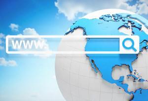
Did you know that 75% of people judge a website’s trustworthiness by looking at its design? So, if you want your site to be a hit with visitors, you have to spice up that navigation game!
Get ready to dive into seven fabulous web bar designs that enthuse your audience.
Whether you’re a tiny startup or a big corporation needing digital marketing, these navigation menus will have your visitors staying around with delight.
Get ready as we take you on an adrenaline-pumping ride through the world of website navigation!
1. The Magic of Mega Menus in Place of a Web Bar
Mega menus are big, bold, and super organized!
Instead of squeezing everything into a tiny web bar, mega menus spread out to display options right before your eyes. They can neatly organize loads of information, making it easy for visitors to find what they’re looking for without feeling overwhelmed.
Imagine having a website’s pages at your fingertips, neatly categorized and easily accessible. With interactive mega menus, you can even hover over different sections to see a sneak peek of what’s inside, making navigation a breeze.
2. Hamburger Menus: More Than Just Burgers
Hamburger menus are those three horizontal lines at the top corner of websites or mobile apps. They got their unique name because the three lines look like a cute little hamburger!
The benefits of a hidden menu for cleaner website layouts. Hamburger menus may seem small, but they pack a big punch! Websites can keep their structures neat and clutter-free by hiding the menu options behind those three lines.
It’s like having a secret compartment to store all the important stuff, so it’s there when you need it but out of the way when you don’t. This keeps the focus on the main content and makes the website look super sleek and modern.
3. Exploring Cards as Navigation
Say hello to cards:
- Small
- Stylish
- Interactive
Imagine your website’s navigation transformed into a deck of cards, each one representing a different section or page.
Cards are little magic portals that take you to the content you want with just a click or tap. They’re sleek, visually appealing, and perfect for displaying information in bite-sized pieces.
Cards work their magic by presenting options in a clear and organized manner. Instead of overwhelming visitors with a long list of links, cards break down the choices into digestible chunks. This simplicity makes it easy for users to decide where to go next, like flipping through a deck of cards to find your favorite one!
4. Parallax Scrolling for an Engaging Journey instead of the usual Web Bar
Discover the enchanting parallax scrolling effect. Picture scrolling through a website and feel like you’re floating on a cloud! That’s the magic of parallax scrolling.
Instead of everything moving together as you scroll, parallax creates a 3D-like effect where background elements move slower than the foreground. It’s like a mesmerizing dance of layers, giving your website a touch of enchantment.
Parallax lets you present your content in a unique and immersive way. Whether it’s a gripping tale, showcasing your products, or sharing your brand’s story, parallax makes it feel like a magical ride, keeping visitors engaged and hungry for more.
5. The Adventure of One-Page Navigation
Navigate an entire website in a single scroll. Yes, you can! Instead of clicking through different pages, users can scroll through a seamless information journey.
The beauty of one-page navigation for streamlined user experiences. Say goodbye to the confusion of traditional menus; one-page navigation keeps things simple. Users can find everything they need in one place, making it easy to access essential sections without getting lost in the maze of links.
6. Interactive Image Maps: Unleashing Creativity
Introducing image maps! They are more than just static pictures.
Picture this: your website’s images coming to life with interactive hotspots! That’s the magic of interactive image maps.
Instead of passive pictures, image maps allow you to add clickable areas to your visuals. It’s like turning your images into an exciting map, guiding visitors on a fun and interactive adventure.
With image maps, it becomes an adventure! Each hotspot on the image can lead users to different sections or pages.
It’s like a treasure hunt! Clicking on hotspots to uncover valuable information. Engaging your visitors in this playful way creates a memorable experience and encourages them to explore more.
7. Footer Navigation: Not Just a Boring Corner
The underestimated power of footer navigation. It’s not just a place for copyright information; it can be a valuable navigation tool!
With footer navigation, you can provide quick links to essential pages, like a map guiding visitors to exciting destinations right before they leave. Please don’t overlook this valuable space; it’s a golden opportunity to keep your audience engaged until the end.
Footers can be the supporting cast of your website, making the user experience even better. Placing essential links in the footer gives users a safety net if they get lost or want to revisit specific sections.
Ready to Design Your Web Bar?
Whether you’re a small business just starting or a seasoned company seeking to revamp your online presence, these unique web bar designs offer boundless opportunities to make a lasting impact on your visitors.
Remember, a user-friendly and visually appealing website wins potential customers’ hearts (and trust!).
Are you looking to vamp up your site navigation design? Book a call today!